Human Collective
This organization stood for something I’ve always respected – playing a part in society without money coming into the picture. And when it was also for a close friend, I was only too happy to take up the challenge of doing the identity design.
The brief was clear. Human Collective is a social initiative that brings different people from various backgrounds together for finding sustainable solutions to societal issues.
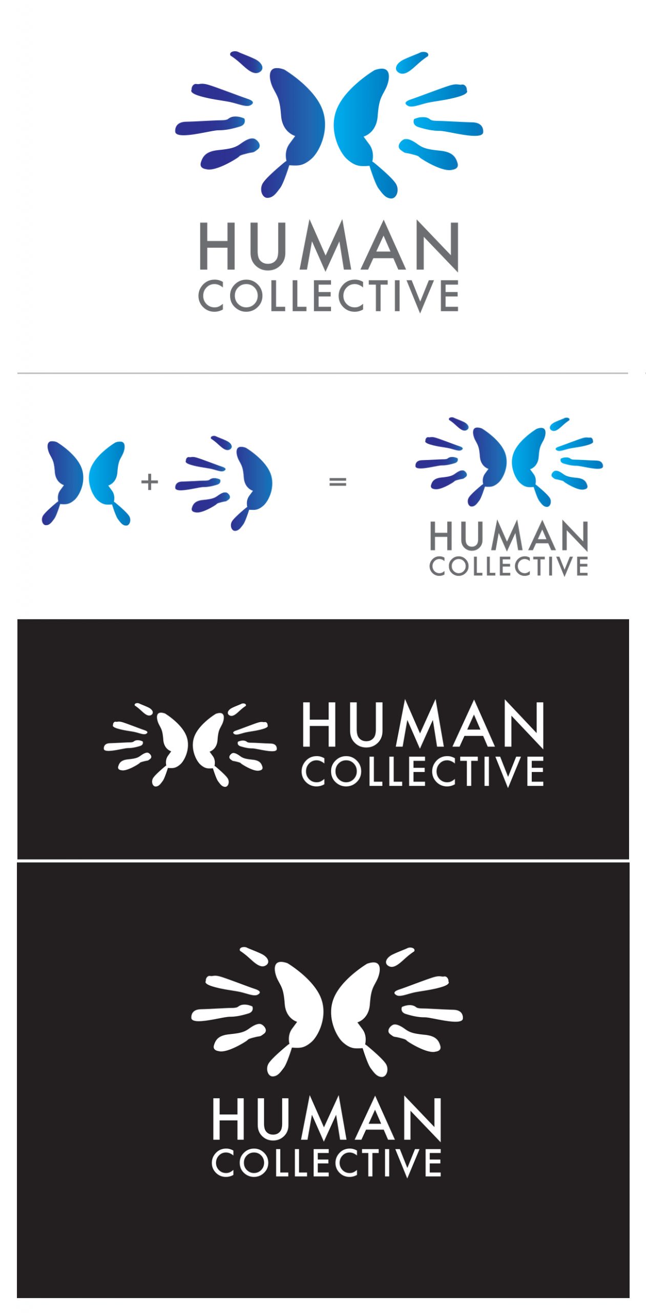
At first the logo would remind one of a butterfly. And then on looking again, one see’s two hands together, fingers fanned out.
Here, the fingers represent the diverse people united for a good cause. The subtle variations in colour highlight the different minds, different perspectives coming together.
The butterfly represents freedom. Freedom to come together for a good cause, freedom to address social evil and injustice without reservations…
We had a wonderful time working on this as it was a novel idea. It took a while to crack the concept, but at the end it was a really satisfying experience!
Brand Identity
